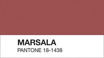
Marsala, the 2015 Pantone Colour of the Year
Every year, the global authority on colour, Pantone and their worldwide clients meet in a European Capital to decide on the “Colour of the Year”. This colour is based on trends and is then used by designers for a variety of purposes. Marsala, the robust earthy wine red was Pantone’s choice for 2015.
It was a surprise to some, because it wasn’t as different as many might have expected to the previous year’s choice, Radiant Orchid. But there’s a counter-argument that says each year’s colour is almost by definition a continuation of trends that would have been influenced by the previous year’s choice. So perhaps we should expect a continuing evolution of colours in the Pantone selection year-on-year.
Here’s what Leatrice Eiseman, executive director of the Pantone Color Institute® had to say about the 2015 choice, Marsala.
“Much like the fortified wine that gives Marsala its name, this tasteful hue embodies the satisfying richness of a fulfilling meal, while its grounding red-brown roots emanate a sophisticated, natural earthiness. This hearty, yet stylish tone is universally appealing and translates easily to fashion, beauty, industrial design, home furnishings and interiors… Marsala enriches our mind, body and soul, exuding confidence and stability”
Pantone’s view is that this is a colour that appeals to both men and women, works with multiple skin tones and can have a wide variety of design uses.
What do you think of their choice this year? Our sister company Zayah Jewellery creates a colour palette each year around the Pantone Colour of the Year, to help clients choose an overall look around which to decide how to wear new or existing jewellery. The Pinterest board inspired by Marsala is part of creating that palette, and you can see it below.
(PS If the board isn’t showing above, refreshing your browser should make it appear, or you can click on this link to see it on Pinterest. The problem is usually a technical one at Pinterest’s end)


