
Have You Heard of the Pantone Colour of the Year?
Even if you haven’t heard of the Pantone Colour of the Year, you’ve probably heard of Pantone as a term used when choosing colours. The company behind the name has created a standardised colour matching system that gives designers a way to ensure consistent use of a colour irrespective of material or medium.
And in today’s marketing-conscious world, there’s big money involved in colours. For example, Cadbury made headlines when they lost a battle in an attempt to trademark the particular shade of purple they use.
Colour is something that touches many aspects of life, and designers of many disciplines can play a big role in changing the colours we see around us, especially through trend-conscious industries like fashion.
A few years ago, Pantone started the concept of the “Pantone Colour of the Year”, an exercise in seeing if they could pick a single colour which represented everything that was happening in the design world that year. It’s a strange concept at first, and easy to be cynical about. But on further reflection, it’s possible to see it as an interesting exercise, especially for those in industries that rely on colour.
Every year, Pantone executives and their worldwide clients meet in a European Capital to decide on the “Colour of the Year”. This colour is based on trends they’ve identified, and is then used by designers across industries for a variety of purposes.
A Classic Example – The 2014 Pantone Colour of the Year
The 2014 colour of the year is “Radiant Orchid” which is a pinkish purple.
Here is what Leatrice Eiseman, Executive Director at Pantone Color Institute has to say about this colour.
“Radiant Orchid descends from the purple family, which is kind of a magical color that denotes creativity and innovation. Purple is just that kind of a complex, interesting, attracting kind of color. . . [The] back-story to purple is that it inspires confidence in your creativity, and we’re living in a world where that kind of creative innovation is greatly admired. In the world of color, purple is an attention-getter, and it has a meaning. It speaks to people, and we felt that it was time for the purple family to be celebrated. That’s why we chose the particular shade called Radiant Orchid.”
At Zayah, pinkish purples have been part of our visual identity from the beginning, and has been prominent in our logo, website and printed collateral. We’ve associated purple with creativity and innovation, so were really pleased with the 2014 choice!
Using the Pantone Colour of the Year in Practice
But going back to what it means in practice, if we’re honest it hasn’t changed that much for us in practice, nor do we see too much around us. The exception might be the fashion industry, where what’s seen on the catwalks has a huge influence on what’s in the shops and what we wear for at least the next few months. If catwalk designers are inspired by the Pantone colour of the year (or vice versa), then that’s certainly one way in which it makes a difference.
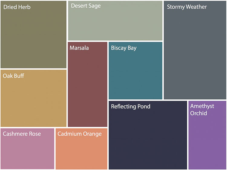
You might be interested in how we’ve taken a Pantone colour of the year and used it to create colour palettes for use in any kind of design. Below is a Pinterest board created by our sister company Zayah Jewellery, which they use to give clients ideas on colours to complement or contrast with a piece of jewellery around the 2014 Pantone selection.